Honeywell AOG Zero: Building an APU Health Monitoring System in a Week
Written by Rohan Nandan on September 14, 2026 · 6 min read
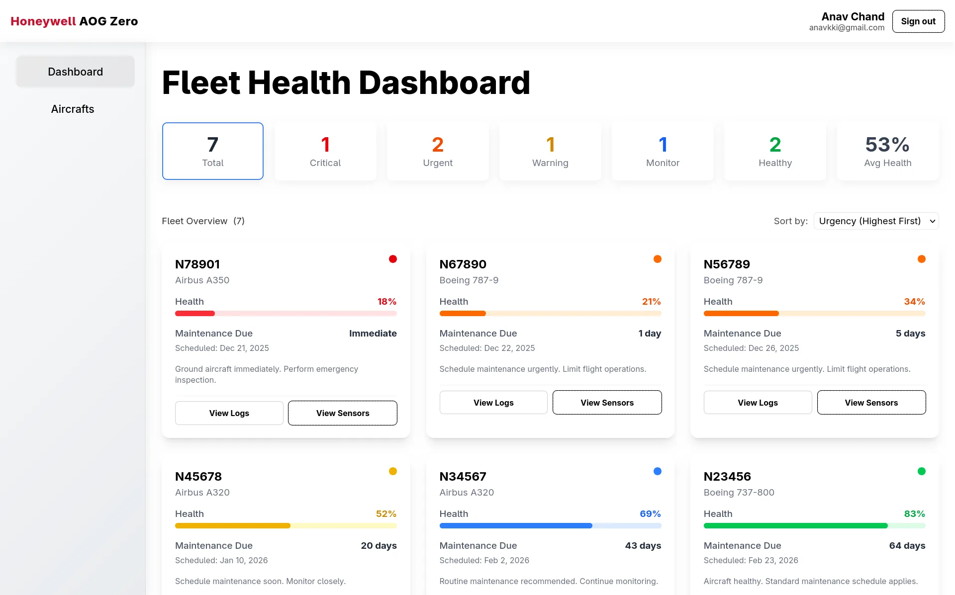
Source: github.com/SRVSRR/aog-zero
Problem
Aircraft on Ground (AOG) events — planes grounded by unexpected mechanical issues — are among the most expensive failure modes in aviation. Every grounded hour costs an airline real money, and a large share of AOG events trace back to a handful of components degrading quietly before anyone notices.
AOG Zero targets one of those components: the Auxiliary Power Unit (APU), the small turbine that powers an aircraft’s systems while the main engines are off. The goal was to catch APU degradation early enough that maintenance becomes a scheduled event instead of an emergency.
The project was an eight-person hackathon build completed between December 15 and 21, 2025. The constraint was not just catching failure early, but doing it across a whole fleet with a dashboard a maintenance manager could act on in time.
Approach
We split the work into three layers: a synthetic but physically grounded sensor simulator, a rule engine that turns raw sensor values into a health score and maintenance priority, and a dashboard for fleet managers to act on it.
1. Health scoring from sensor thresholds
Every aircraft’s health score (0–100) maps to a five-tier priority band, each with its own days-until-maintenance window computed by linear interpolation inside the band rather than a flat per-tier number — so two aircraft in the same Warning tier still get different urgency if one is closer to the next tier down:
| Priority | Health score | Days to maintenance |
|---|---|---|
| Critical | ≤ 20 | 0–1 (ground immediately) |
| Urgent | 21–40 | 1–7 |
| Warning | 41–60 | 7–30 |
| Monitor | 61–80 | 30–60 |
| Normal | 81–100 | 60–90 |
A flight-hours multiplier tightens the window for high-utilization airframes: aircraft with over 5,000 logged hours get the window cut by 30% (× 0.7), over 3,000 hours by 15% (× 0.85), and over 1,000 hours by 5% (× 0.95). Within the same band, an urgency_score (100 − health) ranks aircraft so the worst-off appears first.
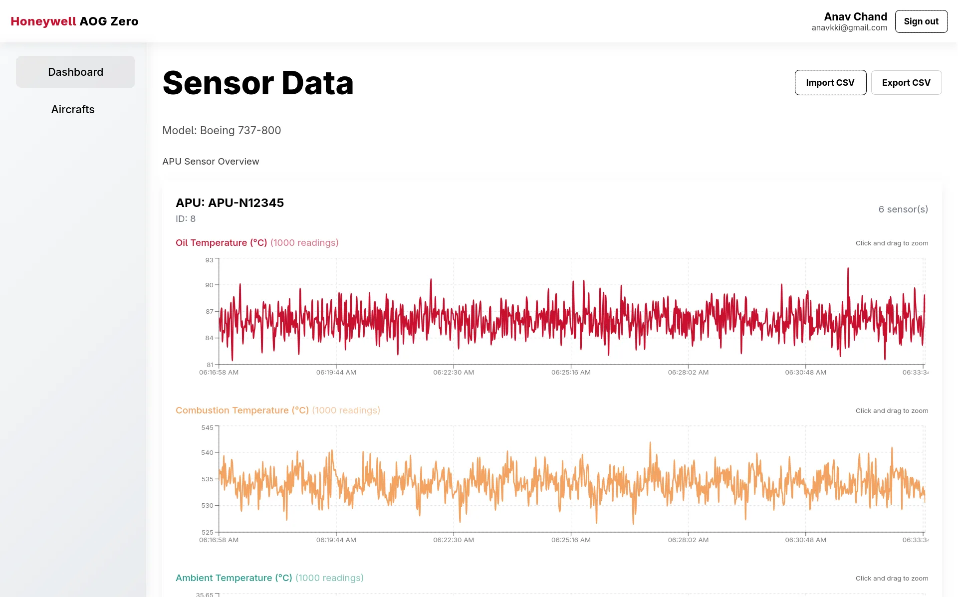
The health score itself is computed per sensor by normalizing the recent mean reading between a healthy and critical threshold — for example, oil temperature: healthy = 80°C, critical = 140°C — then averaging across all six sensors on the APU (oil temperature, combustion temperature, ambient temperature, pressure, RPM, vibration). It is a straightforward, explainable rule-based calculation, which turned out to matter more than we expected (see Lessons).
2. The trained model that never shipped
In parallel, we built a genuine data-science pipeline in the ai/ folder. A dataset generator produced synthetic APU sensor series, a preprocessing notebook extracted 15 statistical features per sensor (mean, standard deviation, RMS, kurtosis, skew, IQR, and more), and a training notebook fit a LinearRegression model predicting Remaining Useful Life (RUL) as a percentage. On held-out data the model scored R² = 0.970 with an MSE of 12.76%² — a strong result on a hackathon timeline — and it was saved as linear_rul_model.pkl, built from a 16,000-row engineered feature set.
The backend loads that pickle at startup. But the live health-scoring path never calls it: compute_health_from_model() delegates to the threshold-based function instead. Under deadline pressure, “explainable and done” beat “more accurate but needs more integration work.”
3. Authentication and the dashboard
Auth runs on Firebase — Google OAuth via signInWithPopup, with the ID token mirrored into a short-lived cookie that Next.js middleware checks before allowing access to /dashboard and /aircrafts. The WorkOS AuthKit setup floated early on never made it into the codebase.
My contributions were concentrated on the frontend, mostly in the aircraft list, the per-aircraft dashboard, and flight-log tooling:
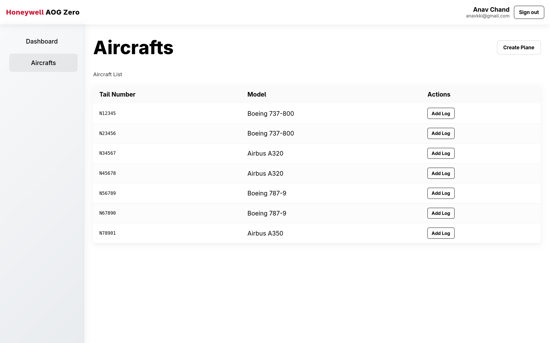
- Search, sort, and filter-by-health on the aircraft list page.
- The flight-logs page, including toast notifications on log actions.
- CSV import and Excel export (via
exceljs) for sensor and log data. - Sensor-reading charts built with Shadcn.
- A pass of button, hover-state, and sidebar styling cleanup.
Stack
- Frontend: Next.js 15 (App Router), TypeScript, Firebase Authentication, Shadcn-based charts.
- Backend: FastAPI, SQLAlchemy, Pydantic, Uvicorn.
- Database: PostgreSQL —
Company→Aircraft→AircraftPart(APU) →PartSensor(six sensor types) →SensorReading, plus a separateAircraftLogtable for cumulative flight hours. - ML tooling: scikit-learn, pandas, numpy, Jupyter — used offline for feature engineering and model training, not in the request path.
- Infra: Docker, Azure DevOps for CI, mirrored to GitHub.
Four core REST endpoints (/aircrafts, /aircrafts/{id}, /aircrafts/{id}/flights, /health), each duplicated under /api/*.
Results
The team took 3rd place at the event, and I picked up Best Frontend Developer.
- 119 commits from 8 contributors across roughly one week.
- Seven seeded aircraft spanning Boeing 737-800 and 787-9 and Airbus A320 and A350 airframes, at fixed degradation levels from 5% to 90%, each with 1,000 synthetic readings per sensor.
- An offline RUL model (Linear Regression on 15 statistical features per sensor) at R² = 0.970 on held-out data.
- A fleet dashboard that surfaces the worst aircraft first, filters by health band, and exports sensor and log data.
Lessons
- An explainable shipped model beats an accurate shelved one. The R² = 0.970 RUL model was the technical highlight, but the production path ran on threshold rules because the integration work was underestimated. Value only exists when the model is reachable from the demo.
- Wire the model into the request path from day one. Retrofitting a trained model into a shipped rule engine is harder than building the integration alongside the model. Rough integration early wins over polished and absent.
- A README drifts from the code fast. The README described WorkOS AuthKit and a 30-second auto-refresh that were never in the codebase, and implied the ML model powered the live health scores. The shipped artifact, not the intention, is what needs documenting.
- Parallel work needs a merge strategy. Eight people, an Azure-to-GitHub mirror, and a mid-sprint auth transition produced merge-conflict residue that cost a cleanup commit. Agreeing on ownership boundaries and a rebase cadence early pays for itself.
- Frontend depth wins demos. The search, filters, CSV import, Excel export, and charts are what the judges actually touched. A deep, polished client next to a simple backend beat a fancy backend with a thin UI.