Understanding Calibration Curves: Why They Matter and How to Read Them
Written by Rohan Nandan on September 22, 2026 · 5 min read

If you’ve built a classifier and only checked accuracy or AUC, you’re missing half the picture. A model can rank predictions correctly and still lie about how confident it should be. Calibration curves exist to catch exactly that.
What Is Calibration?
A model’s predicted probability should mean something. If a classifier predicts a 70% chance of rain and it is well-calibrated, then it should actually rain about 70% of the time on days it makes that prediction. That is calibration. It has nothing to do with whether the model separates positives from negatives well (that is discrimination, measured by AUC). It is about whether the number it outputs is trustworthy on its own.
This distinction trips up a lot of students. A model can have an excellent AUC — ranking positives above negatives almost perfectly — and still be badly calibrated, because the actual probability values it produces are distorted. Ranking and calibration are separate properties. You need both whenever you plan to use the probability itself: for risk scores, decision thresholds, or as input to another system.
Why Should You Care?
The practical case for checking calibration comes down to where raw probabilities get used:
- Thresholding decisions. If you flag transactions as fraud when
p > 0.5, that threshold only makes sense if 0.5 actually corresponds to a 50/50 real-world split. - Combining models. Averaging or stacking probabilities from several models falls apart if the individual probabilities are uncalibrated.
- Risk communication. Telling someone they have an 80% risk when the true rate is closer to 50% is a serious problem, even if the model correctly orders who is higher-risk.
- Some models are notoriously bad at this. SVMs don’t produce probabilities naturally — theirs are retrofitted with Platt scaling. Boosted trees tend toward overconfidence at the extremes. Knowing this tells you when to be suspicious before you even plot anything.
How to Read a Calibration Curve
A calibration curve (also called a reliability diagram) is built in three steps:
- Take the predicted probabilities for the positive class from a test set.
- Sort and group them into bins — usually 10, fewer with limited data (0.0–0.1, 0.1–0.2, and so on).
- For each bin, plot the average predicted probability (x-axis) against the actual fraction of positives in that bin (y-axis).
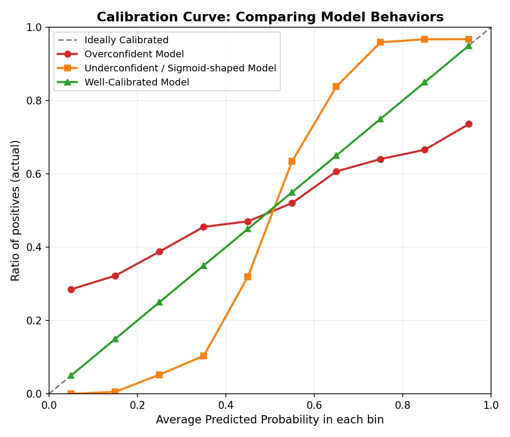
Then compare against the diagonal line y = x, which is perfect calibration. A flawless model would put every bin’s actual positive rate exactly where its average predicted probability says, and every point would sit on that line.
In scikit-learn, those two arrays are one call:
from sklearn.calibration import calibration_curve

prob_true, prob_pred = calibration_curve(y_test, y_proba, n_bins=10)
Reading the Deviations
The shape of the deviation from the diagonal tells you how the model is wrong:
- Curve below the diagonal — the model is overconfident. Higher predicted probabilities than reality supports: a bin averaging 0.8 with only 50% real positives means the model is too sure of itself.
- Curve above the diagonal — the model is underconfident. Outcomes happen more often than the model predicts.
- S-shaped (sigmoid-like) curve — common with margin-based classifiers like SVMs. Predictions pile up near 0 and 1 while the middle is poorly represented. This is why Platt scaling (fitting a sigmoid over the raw output) is the standard fix there.
- Jagged, non-monotonic curve — sometimes genuine miscalibration, but often a sample-size artifact. A bin with five points gives a noisy estimate of its true positive rate. Check the per-bin counts before concluding the model is broken.
- Diverges in the middle but converges at the extremes — the model is decisive and roughly correct when very confident, but muddled on mid-range judgment calls.
A Quick Example
Suppose an SVC’s curve stays flat at 0 across predicted probabilities 0.0–0.4, jumps sharply to near 1.0, oscillates around the diagonal in the middle, then converges near the top. Reading it:
- The flat section means the model assigns no low-probability nuance — everything is “definitely negative.”
- The sharp jump is a red flag: a narrow predicted range covers a huge range of actual outcomes, so confidence levels there are meaningless.
- The middle oscillation is inconsistent behavior — some bins overconfident, others underconfident.
- Convergence near 1.0 is reassuring: near-certain predictions are usually right.
Verdict: the rankings may still be decent, but the raw probabilities should not be trusted or used directly.
What to Do If Your Model Is Miscalibrated
You don’t need to retrain from scratch. CalibratedClassifierCV wraps the existing classifier and fits a correction on held-out data:
from sklearn.calibration import CalibratedClassifierCV

calibrated_clf = CalibratedClassifierCV(base_estimator, method='sigmoid')
calibrated_clf.fit(X_train, y_train)
Two methods to choose between:
method='sigmoid'(Platt scaling): best for small datasets and roughly sigmoid-shaped miscalibration — the typical SVM case.method='isotonic': more flexible and non-parametric, better with larger datasets, but prone to overfitting on small ones.
Conclusion
A calibration curve answers a question accuracy and AUC can’t: can you trust the number, not just the ranking? The habit is cheap — whenever a probability will be used as more than a ranking signal, plot the curve first. A few lines of code now beats decisions built on confident-sounding nonsense later.